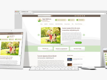
CarePlus Homepage Redesign
Description
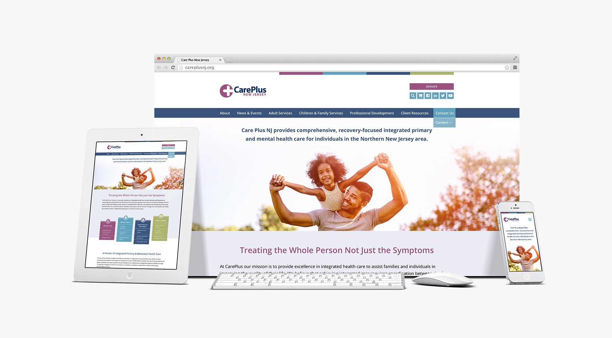
Sometimes the biggest website design updates are the most subtle. Our long-term, trusting partnership with CarePlus allowed the R&J team to work closely with the CarePlus team to identify much needed improvements in an update homepage. The challenges identified included a poor mobile user experience, messaging that wasn’t connecting with the web audience, users inability to locate services they needed, and the inability to focus on specific service areas for the organization.
By reorganizing the information on the page, adding key calls to action, incorporating imagery that speaks to their audience, designing pillars in their brand colors to reflect their primary services, and standardizing many of the items previously scattered throughout the page, R&J was able to establish a clear brand message for this not-for-profit website.
Client
Care Plus NJ
ShareCare Plus NJ
